Part 1A: Describe Meaning of Formula
In the context of Appendix A in the textbook, what is the meaning of the following formula? Describe what is denoted by each of the three letters A, B, and C. Only two out of three letters may denote a number. Which of the three letters may denote a matrix? Which of the letters may denote a vector? How is this formula related to the mathematical constants e (that is, the base of the natural logarithm, which is approximately equal to 2.71828) and π (the ratio of circle's circumference to its diameter, which is approximately equal to 3.14159)? Where is the mean? How and when can we get the standard deviation? Where is the covariance?

|
Insert your answers here.
|
Part 1B: Plot p(A) for B=2 and C=3
This can be done in Excel using the function NORMDIST. Hint: recall the difference between standard deviation and covariance. Insert your plot below.

Part 2: Find K-Means Algorithm in Lloyd's paper
Find several (no more than three) paragraphs that describe what later became known as the k-means algorithm in the paper by Lloyd (1957, 1982) (the document is also available in Canvas). Describe their locations within the paper using a precise reference (e.g., page X paragraphs Y and Z). Also, answer the following two questions: How does he denote the value of the centroid for the α-th cluster? His paper describes the special case of k-means with how many dimensions? Insert the reference and answers the two questions into the space below.
Insert your reference and answers here.
Part 3A: Cluster 'Old Faithful' Dataset Using K-Means
Run the k-means clustering on the 'Old Faithful' eruptions dataset with k=2 (i.e., for two clusters). The dataset is available in the course-provided virtual machine (VM). Visualize your clusters using a scatter plot and insert it in the space below. Your plot should have relatively clear separation between the two clusters with only a few seemingly incorrectly assigned points. Also, provide a CSV or Excel file with the cluster labels for each data point from which your plot was built. An example greyscale clustering plot that should be similar to your results is included. Preferably, your plot should appear in full color.

|
 Insert your plot to replace the placeholder above.
 |
Part 3B: Cluster 'Old Faithful' Dataset Using Gaussian Mixtures
Run the EM algorithm for Gaussian Mixtures to cluster the 'Old Faithful' dataset with two components and full covariances. Visualize your clusters using a scatter plot and insert it in the space below. Your plot should have very good separation between the two clusters with very few seemingly incorrectly assigned points (hint: you may need to use smaller convergence tolerance or larger number of iterations to achieve very good separation). Also, provide a CSV or Excel file with the cluster labels for each data point from which your plot was built. An example greyscale clustering plot that should be similar to your results is included. Preferably, your plot should appear in full color.

|
 Insert your plot to replace the placeholder above.
 |
Part 3C: Visualize Mixture Components from Part 3B
Visualize the two gaussian mixture components computed by the EM algorithm in part 3b by indicating their means and the eigenvectors of their covariance matrices on a plot. One possibility is to draw two line segments that correspond to the eigenvectors so that they intersect at the mean for each of the two mixture components. This approach is used in the example plot shown below. Feel free to explore other approaches for visualization. Also, provide an Excel file that was used to generate the plot (or a description of your approach that is sufficient to reproduce the results if you didn't use Excel).

|
 Insert your plot to replace the placeholder above.
 |
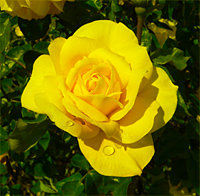
Part 4: Cluster Pixels in Example Image from Wikipedia
In this problem your goal is to reproduce the clustering of the example image (Rosa_Gold_Glow_2_small_noblue.png, provided in the table below). In this image the color information is present only in the red and green channels. This example originates from Wikipedia.
First, update the course app in the VM to version 0.9.8 or later using the 'Update App' desktop shortcut. Second, convert the image to CSV using the 'Images to CSV' tool in the app. Third, cluster the resulting CSV file into 16 clusters using k-means. Finally, visualize the coordinates of the cluster centroids using a scatter plot (e.g., in Excel) and replace placeholder image below with an image generated using this plot. Preferably, your plot should appear in full color. Also include your CSV or Excel file with the coordinates of the centroids as a part of your solution.
Input image with red and green channels:
|
Example scatter plot in grayscale:
|
Insert your scatter plot here:
|
Part 5: Analysis of Unfair Dice
Suppose that you've found a pair of dice in a museum that originates from this set of Roman dice. In this problem, your goal is to determine the probability distribution of the number of dots on the front faces associated with rolling these or other unfair dice. The following table gives the probability distributions of the front faces for each of the two dice.
.jpg)
| ⚀ | ⚁ | ⚂ | ⚃ | ⚄ | ⚅ | |
| Dice 1 | 0.17 | 0.18 | 0.20 | 0.16 | 0.12 | 0.17 |
| Dice 2 | 0.18 | 0.17 | 0.13 | 0.12 | 0.20 | 0.20 |
Insert the probability distribution of the number of dots on the front faces these two dice if they are rolled simultaneously in the table below. Also, describe how you would solve the problem if you had to analyze the probability distribution of the number of dots on the front faces observed after rolling N such dice, provided that the distribution of front faces is known for each of them?
| 2 | 3 | 4 | 5 | 6 | 7 | 8 | 9 | 10 | 11 | 12 |
| ? | ? | ? | ? | ? | ? | ? | ? | ? | ? | ? |
Insert your text here.
Part 6 (Extra Credit): K-Means++ Versus K-Means
Explain the relationship between k-means++ and k-means. What are the advantages of using k-means++? What are some of the possible disadvantages? What alternatives are there for k-means++ (include references in your response)?
Insert your answer here.